Meet Mckenna’s Rae of Hope Foundation
Mckenna’s Rae of Hope was founded in 2017 after Mckenna Rae Johnson took her life, and the Kearney Community was drastically impacted. The foundation’s mission is to foster awareness, resilience, and social change in hopes that these will help prevent suicide. The foundation has flourished and has become a well-known suicide prevention foundation in central Nebraska.


What’s The Problem?
Mckenna’s Rae of Hope logo is hard to scale and cannot be seen on multi-colored backgrounds. They have also grown to a well-known foundation in the community, and a redesign would be an excellent choice for them to connect to their new audience and be able to scale their logo to a smaller size without it being hard to read.
My Ideas and Brand Guide to Follow
Promotional Campaign Pieces to Create:
Posters
Create two to three posters that are eye-catching and informative about mental health.
Apparel
Create two sweatshirts and one journal that represents hope and involvement.
Outdoor Component
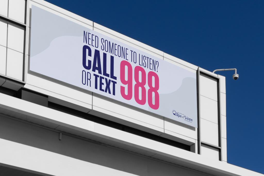
Create two outdoor components that are hopeful and use strong typography for quick, eye-catching views.
Logo
Create a logo for Mckenna’s Rae of Hope that includes sun or rays in it and make sure it matches the mission of Mckenna’s Rae of Hope
Brand Colors & Their Meanings:
#F3B94B
The color gold evokes a sense of richness, opulence, and grandeur. It can evoke feelings of celebration, achievement, sophistication, and refinement.
#54B1B0
The color turquoise often evokes a sense of calmness, serenity, and tranquility. Turquoise can also evoke feelings of rejuvenation and balance, offering peace and harmony to those who encounter it.
#E54285
Magenta exudes a vibrant energy that is both bold and alluring. Magenta is often associated with uniqueness and individuality, captivating attention and sparking imagination.
#E6EBFC
Light lavender embodies a delicate and soothing emotional essence. It evokes feelings of tranquility, calmness, and relaxation.
#8280D8
Lavender evokes a subtle yet enchanting presence that inspires peace and harmony, encouraging introspection and emotional balance.
#06133F
The color navy evokes a sense of depth, stability, reassurance, security, and strength. Navy is a versatile hue capable of conveying both calmness and purposeful determination.
Typography & What They are Used For
Kohinoor Telugu:
Used for subheadings for body text and body text.
Selfie Neue Round:
Used for expressive text and headings/subheadings.
Rama Gothic M:
Used for headings and subheadings.
Logo


Logo Rules
The logo works well with any brand color, but avoid using Magenta (#E54285) on a Gold (#F3B94B) background. Also, it’s best not to mix Turquoise (#54B1B0) and Lavender (#8280D8) as they clash, making it hard to read when one is the logo and the other is the background color.
Project Pieces


